Colorful is the new black! From fashion to architecture, now is the time to dare! Have you noticed the movement of luxury brands waving to more colorful stores? This trend of "dopamine fashion" appears during the pandemic, bringing more colorful outfits in order to transmit all this color to peoples lives, which we agree, needed. In neuroscience, it's already more than proven that colors, whether in spaces or in the clothes you wear, provoke sensations and feelings, so by the same logic, a more cheerful look can, scientifically, bring you more joy. As we know, trends normally depart from fashion and the arts to architecture, and it has now arrived as a big bet on various retail segments: retail dopamine, the most colorful and vibrant stores, also translating sensations for the customer who inhabits that space. The use of vibrant colors also translates as a nod to gen-Z and increasingly seeking to attract consumers of this generation (born in 1990-2010) who already represent a generous share of consumption. Let's bring here some examples of iconic stores and pop ups that adhered to the trend and the strategy of feelings and sensations behind each one, shall we?
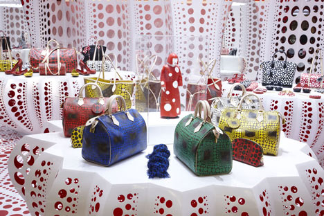
Pink Store
Sources: Dezeen, Archdaily, FRAME, Superfuture
Brands that invest in pink look for a feeling of femininity, love, affection, tenderness, sensitivity, mainly to attract the female audience in a special way, to show that the place is theirs! Moving on to more shocking or neon tones is a color that can bring energy!
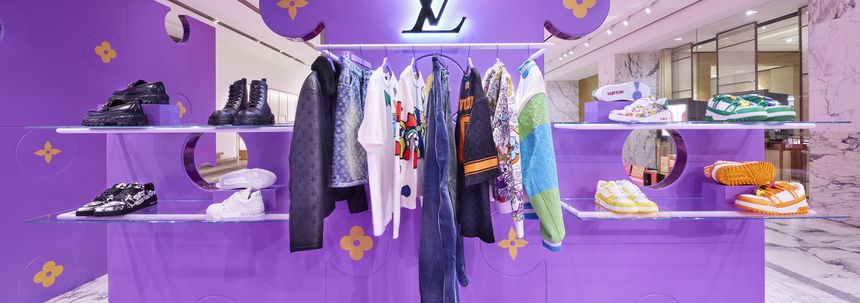
Purple Store
Sources: Forbes, NSMBL
Purple is a bold color that brings something supernatural, inner connection, religiosity, at the same time it is the color of creativity and innovation! Stores that dare in this tone certainly seek to attract as much attention as possible with a new tone! Disruption!
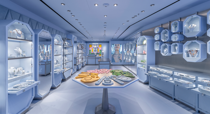
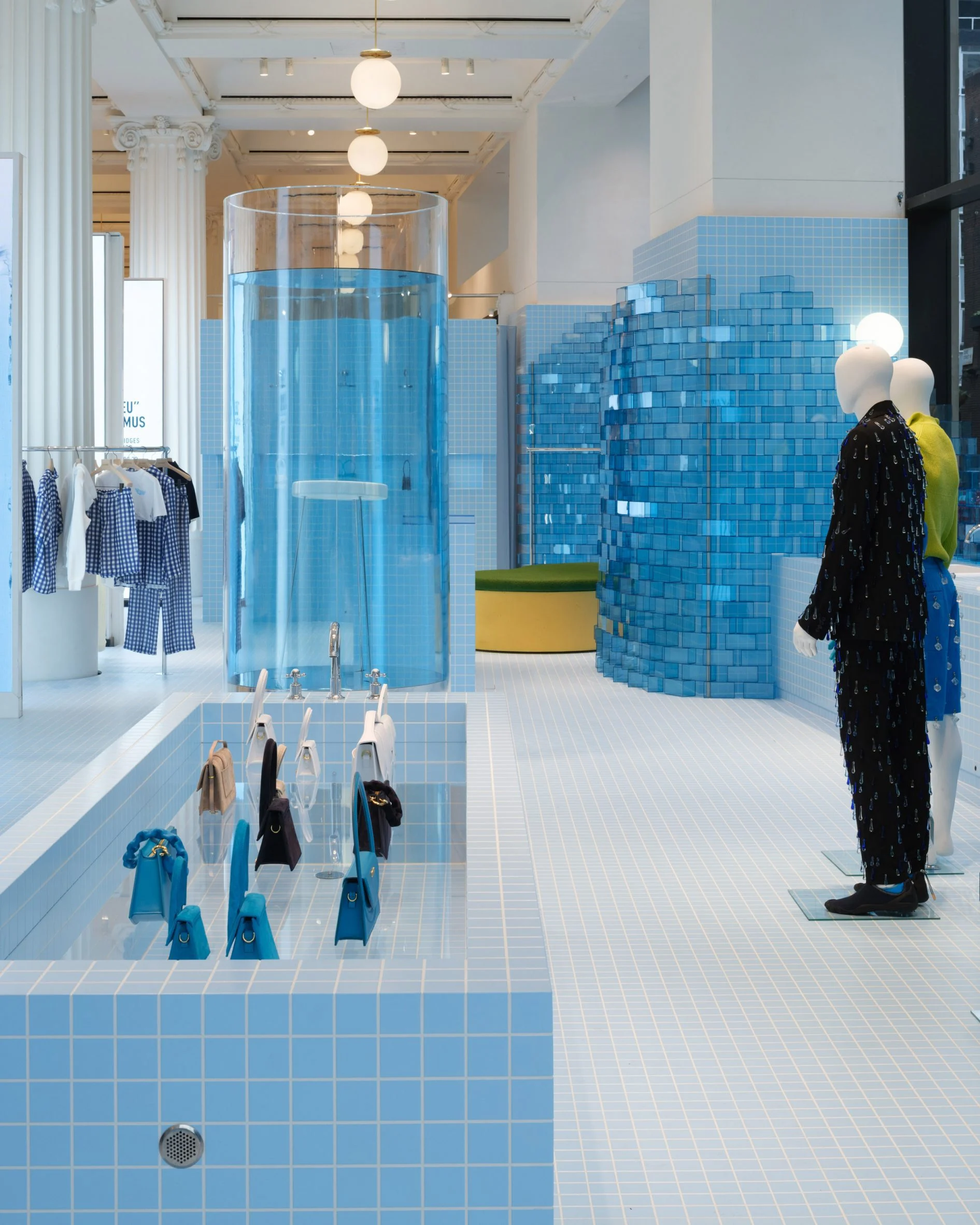
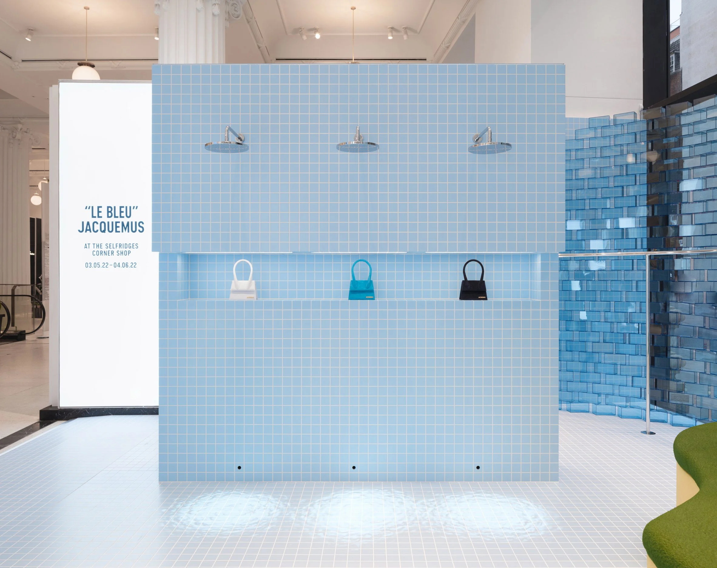
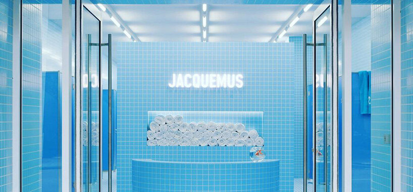
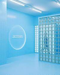
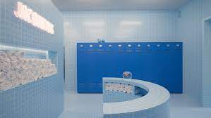
Blue Store
Sources: Retail Design Blog, Dsign Boom, Inside Retail Asia, Gazeta do Povo, Gotham Mag
Companies that invest in blue seek to convey peace, tranquility, elegance, calm. It can be a slightly melancholy or cold color in lighter tones! In darker tones it can bring professionalism or seriousness. Curiosity: blue was the noblest and most expensive pigment during the middle ages, extracted from precious stones and rare flowers, for a long time it was reserved only for royalty, and since to make purple blue pigment was needed, but in tô a lesser extent, this tone was reserved for the church and used by bishops! Hence came Royal Blue, the tone of royalty, therefore, a noble color.
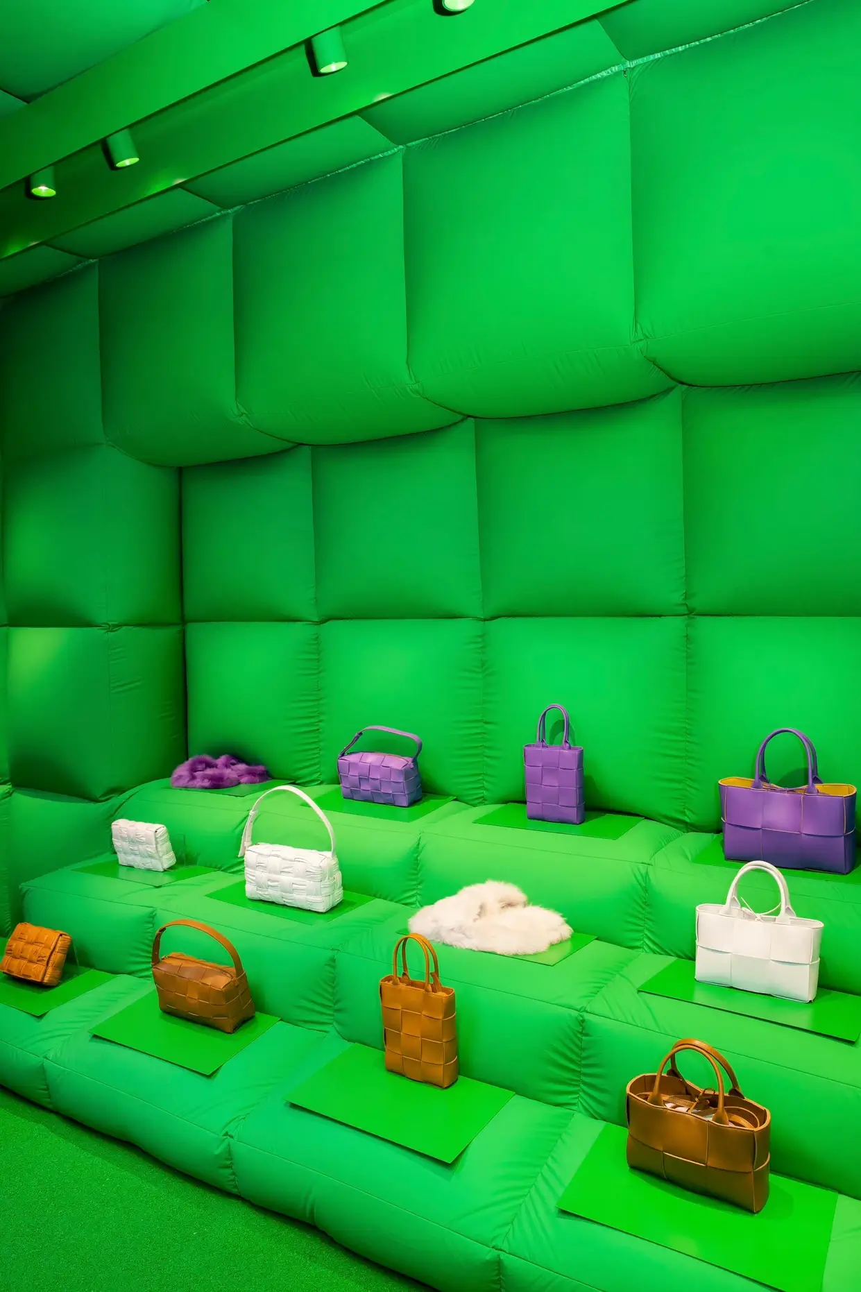
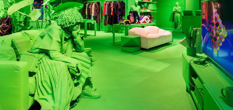
Green Store
Sources: Enfnts Terribles, People of Design, Retail Design Blog
Green refers to financial success, prosperity! The green store in lighter tones can bring tranquility and refer to health, freshness, while in more saturated tones it becomes a store more focused on innovation and technology! Use wisely!
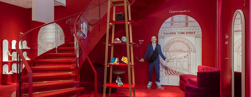
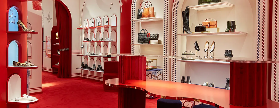
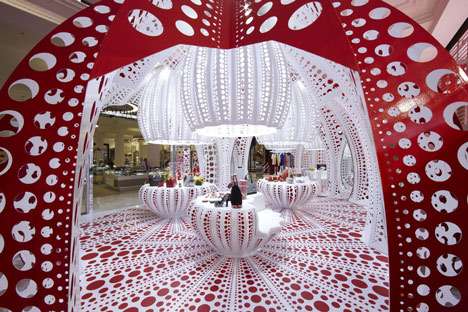
Red Store
Sources: studio xag, Dezeen
Red is reserved for Red Carpet, and therefore luxurious! Sensual color, alert color, blood color and it can also be stressful, or just plain fabulous. It takes courage and knowing how to dose it, but it's true, it's the best color to attract attention.
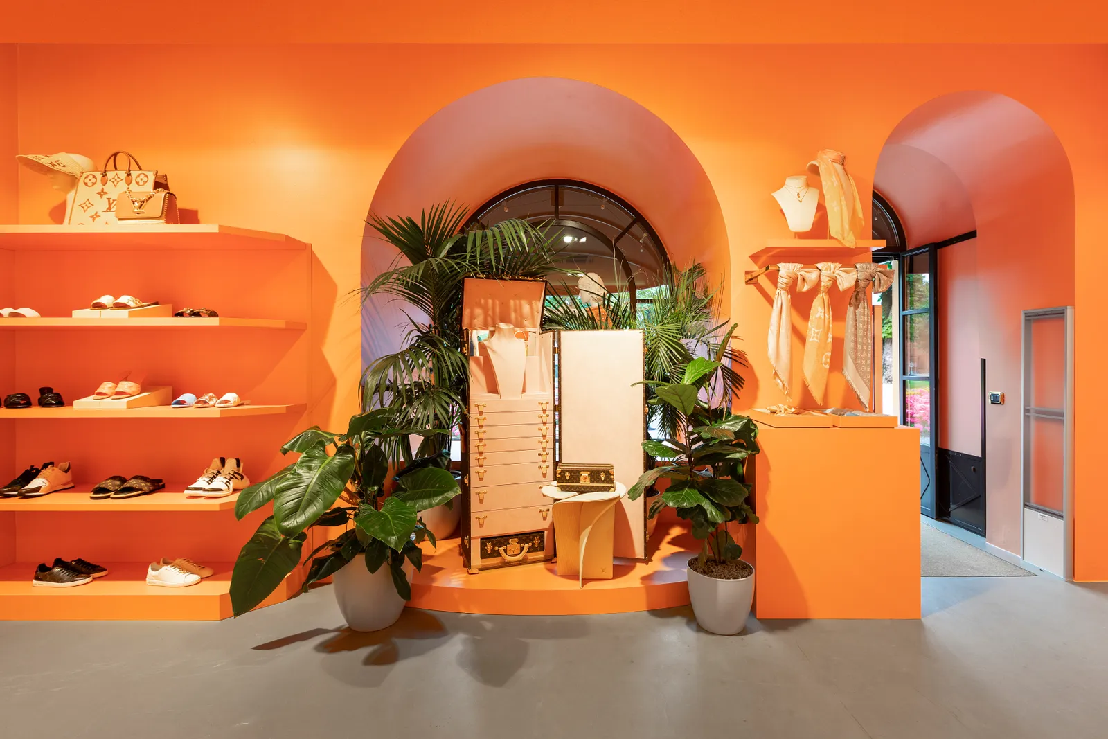
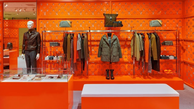
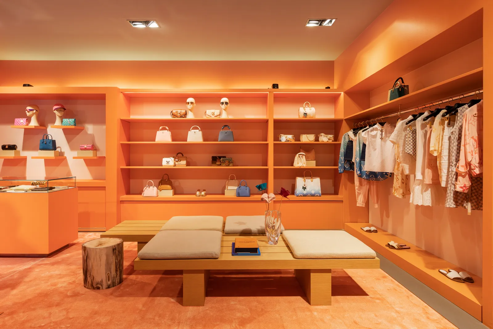
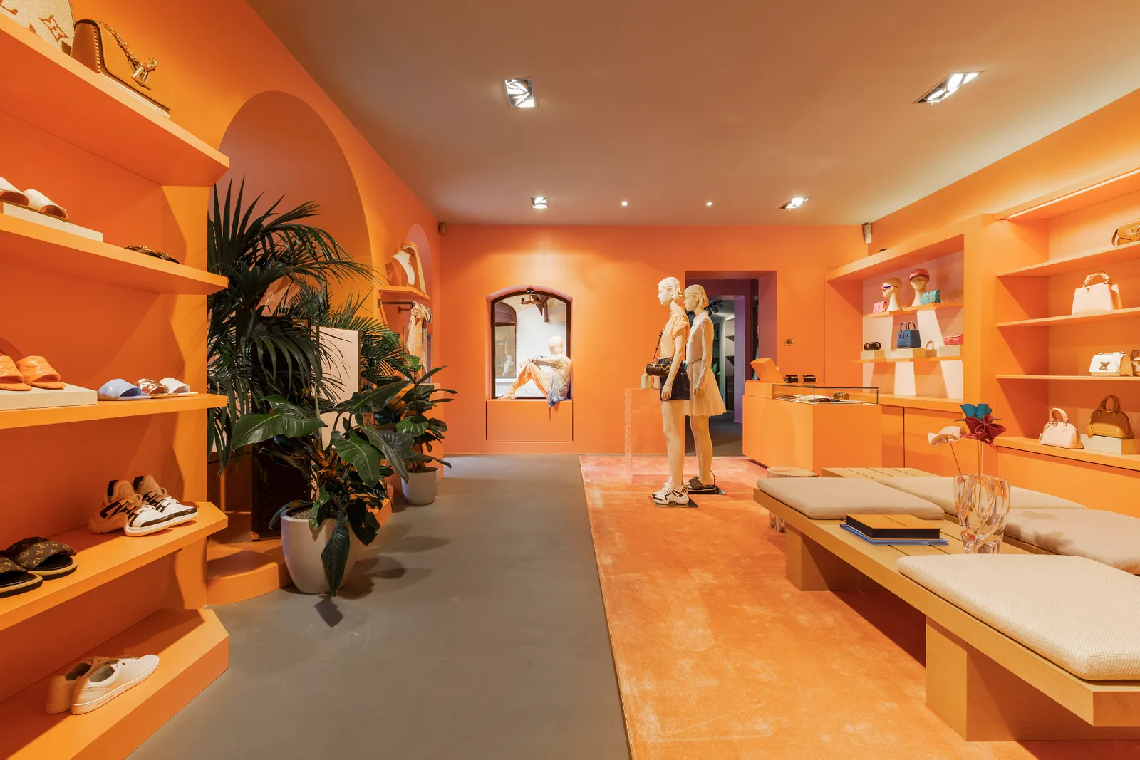
Orange Store
Sources: Vogue, Design Innova, Frame Web
Brands that invest in orange seek to bring energy and joy! In lighter tones it reminds of melancholy, home, summer, beach, vacations, in stronger and more vibrant tones it is an electric, energetic, creative and very happy color! It transmits the feeling of warmth and whets the appetite, so serve a muffin and a good cup of coffee!
Yellow Store
Sources: Super Future, Dezeen, Luxferity
The yellow store conveys energy, warmth and joy, but unlike orange, it has no direct relationship with appetite or melancholy. It's pure energy and draws a lot of attention! It is true that in a store with a colorblock strategy, finding the same color, in the same tone in the entire store can be a little - or a lot - challenging in terms of product placement, which is why we can see that brands use a strategy: to sell products in the same color as the store, notice that a neutral background is created for the insertion of the pieces and with a highlight lighting, so that the piece appears. For the rest of the pieces, outside the store's palette, only lighting is used for highlighting and the pieces, well selected, go down by themselves! And of course, it's always worth investing in the work of a GOOD visual merchandisign, this is the ideal professional to help you position the products inside the store in the best possible way. It is the greatest ally of good retail architecture!
But why should I invest in a Retail Dopamine store?
Attention, buzz and memorization.
An out-of-the-ordinary store stands out not only above the others, but certainly in its physical context. Color block stores, when well done and lit, cause that effect of turning your neck to look, impossible to go unnoticed. And for that reason alone, it guarantees the attention of potential new consumers who weren't even fans of the brand before. In addition, the color block in vibrant colors is necessarily instagrammable, so these are stores that resonate in the media and social networks, ensuring even more flow of organic visibility for the business. Third, retail dopamine stores are memorable! Everything that is unexpected and out of the obvious generates feelings and sensations, and the brain stores them more easily, therefore, when choosing an unusual store, the company conquers the first place in the consumer's mind, and becomes a topic of conversation. So, seeing all this, are you still going to insist on a white or gray store? The moment is to dare! So enjoy and surf this wave!
Renata Cortopassi.

































Comments